
“Data visualization” is far from a new concept for physicians. Almost daily, we see an engaging graph in a study, pamphlet or presentation. Presenting a dataset in a visual format makes it easier for our brains to comprehend research results, healthcare trends, and other complex data points.
“Data visualization places data in a visual context to help people better understand the data’s significance. The process of visualization synthesizes large volumes of data to get at the essence of that data and convey key insights.”
Melanie Meyer, PhD, MHA, RHIT, CCS, CPHQ, journal.ahima.org, Dec. 21, 2017.
While data visualization is already a common tool in research and peer-to-peer communications, most healthcare professionals still do not utilize real-time visuals during appointments. Instead, they manually compute and communicate data such as blood/urine test results or vitals: they click on each property on an EMR, frantically scribble down the relevant data, then try to explain the meaning of these numbers to the patient. While it’s possible to establish a rhythm for this, even two or three additional minutes per appointment dedicated to this computation can add up quickly. Additionally, patient engagement and communication is always a concern.
12 months ago, I began using data visualization software (Auxita) in my practice to address these issues. Here are a few ways it’s changed my practice and transformed how my patients see their health.
Data visualizations make health risks real for patients
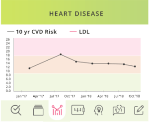
One of the biggest frustrations for family practitioners is getting through to patients about serious health risks, such as diabetes or heart disease. Simply rhyming off blood pressure numbers and repeating warnings about smoking or eating habits is rather ineffective. An image, however, can offer a much harder hitting message.
Not only can the patient see how high risk they are relative to healthcare benchmarks, but they can also see how this risk fluctuates over time and how those changes correlate with different factors like smoking and stress. The visual tells a story about how their health has progressed over time. I have found this to be a far more effective communication tool and change agent than any conversation about test results.
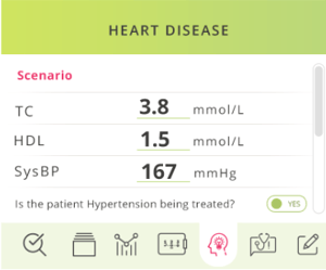
Predictive data visualizations and scenario modelling can show how different changes will impact overall health.
One of the most useful features in Auxita is its ability to predictively map a patient’s health outlook if they were to make certain changes (for better or for worse). This scenario modelling provides patients with a visual of what would happen should they implement better health practices versus continuing on a certain path.
Here’s how this looks in action. I simply click the “Scenario” tab, then type to adjust the blood pressure of this patient:
Data visualizations can offer a rewarding glimpse at patient progress.
Once I started using visualizations, I found that more patients in high-risk categories were taking my advice - regulating their medications, watching their diet, cutting down on high-risk behaviours and so on. When they returned to my office, it was wonderful to be able to show them how their risk of heart disease or diabetes had decreased thanks to their lifestyle changes.
With the exception of healthy weight loss, most positive changes people make to their health are invisible. While patients might get some satisfaction from hearing about improved vitals, in my experience nothing quite has the impact of actually seeing a trend line that was going in the wrong direction reverse its path. It’s often the motivation patients need to continue on a healthier path for the long-term.
Data visualizations increase efficiency and accuracy in appointments.
When you are trying to establish risk factors for issues like heart disease or diabetes, it’s important to be able to track trends over a period of time. This can be difficult to do using a traditional EMR; to develop a trend graph manually, you would have to click on each appointment, then each factor. After that, you would need to calculate how those variables interact with each other.
Tracking trends manually is extremely time-consuming, which is why doctors simply cannot allocate enough time to do it for each patient. Usually, a doctor’s understanding of changes and patterns over time is limited to a cursory look at the last appointment numbers and any EMR notes. This restrictive view often prevents doctors from seeing the story behind why a patient’s health looks the way it does, how it has progressed over time, and what possible diagnosis and risk factors are worth noting.
Data visualizations resolve all of these challenges. By mining the EMR for relevant data and automatically presenting it on a trend graph, this software has saved me a lot of time and given me access to valuable insights that would not be readily available from just scanning current numbers. In my practice, this has become indispensable.
Why do data visualizations work so well?
Even the most well-educated brain struggles to process large amounts of complex data if they are left to scan spreadsheets and reports. Data visualization makes these datasets digestible, clarifying patterns over time. This is especially important when relevant figures are located in different sections of a patient’s EMR chart - bringing everything together in a trend graph can make it far easier on the doctor and patient alike to understand what is really going on with a person’s health outlook.
After trying data visualization in my own practice, I strongly advocate this technology for other doctors. It will change the way patients see their health and provide valuable insights to inform your treatments and diagnoses - two advantages I believe cannot be overstated. While I do not recommend embracing every technology that comes along, data visualization and Auxita, in particular, is something I readily recommend to other doctors.
Dr. Barry Dworkin is an Ottawa-based practicing family doctor for the past 28 years and a self-admitted tech geek for over 40. He is also a Medical Advisor for and avid user of Auxita’s platform.
By analyzing patient data, Auxita turns information into valuable insights— saving time and maximizing revenue. Click here to try it for free today!